Monday 30 September 2013

Analysis of Double Page Spread


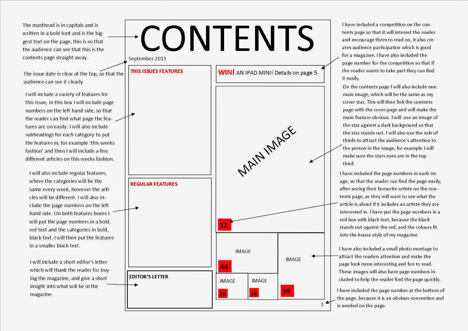
There are many codes and conventions used on the page, for example there is a headline, pull quote and there are columns for the text. The headline is an important convention to have, because it shows the reader what the article is about, the headline is also a pull quote, this is effective because it gives the reader an insight to the article. The way the text has been written in columns makes the page look neat and professional. This also makes the text easier to read, making it fun for the audience so that they enjoy reading the magazine, making it more likely for them to buy the magazine again.

Another convention the magazine uses is a by-line. This is important for the magazine, because it tells the reader who the journalist and photographer is, making sure the journalist and photographer get the credit that they deserve, which meets the audiences expectations. The magazine has also used the same house style, also making the page professional. By using the same font and colours the page is easy to read and links well with the rest of the magazine, making it recognisable to the audience.

The page has one main image, which shows distinct iconography, from the tattoos and the way the star is dressed we can tell that the article is around rock music. The body language and facial expression used by the artiste is also effective, because it also allows the audience to link to rock music, which they will enjoy (as they have bought the magazine) and will encourage them to continue reading. The image also links to the headline and article, this makes the article more fun for the audience and encourages them to read it. The stand first and pull quote also relate to the image creating anchorage, which slowly leads the audience into the article.

The double page spread has also included synergy, in the grey box which is used for extra information, synergy is used by having a web address included on the page. By having a website on the page the magazine is encouraging the reader to go online and find out more information on the magazine and see the latest news. This may then start positive word of mouth if they start talking about the magazine and its website with their friends.

One last thing I think is effective about this page is the way the text has been written. The writer has used highlighted some of the text to show the reader this is a question that the star will be answering, and then has put the answer underneath, this is effective because it makes the text fun and easy to read and lets the reader find the answer to a question they want to know easily. The writer has also used a dropped cap, which makes the text professional, and allows the reader to see where the article starts.

Aquinas Magazine Contents Page


One thing I like about my magazine contents page is the house style, as it links to my front cover and makes the page professional and recognisable to my target audience. Another thing I like about my contents page is the editors letter, as it makes the audience feel welcome and encourages them to buy the magazine again for its next issue. Next time I will also include a photo montage, as it looks effective, as I have also included the page numbers where the reader can find out where abouts in the magazine they can find these images, therefore it makes the pages/features easier to find and makes it more fun for the reader.
 
One thing I would improve on my magazine contents page would be the 'subscribe now' box. I would improve this by including an image of the front cover of the magazine to show the audience a clear link to the magazine and to persuade them to subscribe. I would also include an app, or another use of synergy on this page to encourage reader loyalty. This could also help get the magazine get more readers as an app could get more people talking about the magazine, meaning more people will buy it.

Aquinas magazine front cover


One thing I think is good about my magazine front cover is the house style. I have used the same font and colours throughout the page, this is effective because it makes the page looks professional and the magazine will become recognisable by the house style. I also like having the logos to facebook, twitter, youtube and instagram, because it creates a symbiotic relationship, and will also get the reader to show more interest in the magazine as it will encourage them to 'follow', 'like', 'subscribe', etc to the magazine on these social networking sites, which could then start positive word of mouth for the magazine.
 
However, to improve my magazine next time I would make the logos smaller so that the attention isn't taken away from the cover line or cover star. I also think that if the logos were a similar size together as the barcode the page will look more professional. Another thing that I would do to my magazine front cover to improve it would be to include more cover features as there is some extra space on the right hand side, and I think that the magazine would look better if there was no excess space, therefore more cover features. I would also make the colour of the font for the website, at the bottom, a different colour so that it stands out, and so that the reader can see it more easily.

Wednesday 18 September 2013

Plan front cover


Contact sheet


The ticks represent the images that could be used on the magazine front cover.The images that have been ticked have been chosen, because the backgrounds can be changed (if too busy) and the images are medium close ups, which look professional for a magazine front cover. The people in the images are also looking directly at the camera (facing the audience) making the image look presentable.

I won't be using the second image, because the body isn't facing the camera directly, therefore the image would not look professional on a magazine front cover. I also will not be using the fourth image, because the face is covered, which is also one of the reasons I will not be using the fifth image. Another reason I will not be using the fifth image is because of the lighting. I think that the image is too bright to be used on the front cover of a magzine.

The image I have chosen to use overall, is image eight, because there is a plain background, so the person stands out, also the rule of thirds works well, because the eyes are above the line of the first third. I will also be using this image, because the person is looking directly at the camera, making the image look professional.

Pie chart questionnaire


By looking at my pie charts from the questionnaires I handed out, I have found that rock music and pop are the most popular, as well as 'all types of music'. I have also found that most people use twitter, followed by facebook, I have also found that comedy films are the most popular genre. When looking at television programmes I have found that Coronation Street and Friends are the most preferred from the people answering my questionnaire. The majority of the people also shop at Topshop, and spend their free time reading and socialising with friends. Capital FM seems to be the favourite radio station according to my questionnaire, and there are a wide range of magazine choices. Most people enjoy dance as a hobby, and according to the pie charts snack food is most popular food.
 
From my research the three features I will include in my own magazine will be: chart music, Twitter and Facebook, and Topshop fashion.
Although the majority of people enjoy rock music,I have chosen to feature chart music, because chart music is usually a mixture of different genres of music, (mainly based around pop music, which was the second most popular) also a lot of people said they liked all music, showing that chart music will be a success. Another reason I am going to include chart music is because most people said they enjoyed capital fm, which is chart music, therefore they will enjoy the magazine if it features chart music.
My second feature will be Facebook and twitter as this will create synergy. Most people used facebook and twitter, which is why I am going to feature them on my magazine, because the audience will go on the social networking sites and help advertise the magazine.
My third feature is Topshop, I will include Topshop vouchers and clothing, because it was the most popular place to shop. This will get the audience more interested in the magazine and willing to invest money into it and buy things from it.

Monday 16 September 2013

Contents page

The name of the magazine is written at the top of the page to stand out to the reader, this will allow the reader to clearly see what the magazine is called. It is written in big blocked capitals so that the audience will more than likely remember the name and talk about it to their friends.
The page heading is also witten at the top of the page to tell the reader what page it is, from 'This Week' we can clearly see this page is a contents page.
The content of the magazine shows what is inside the magazine this week, and will also have page numbers so that the reader can see what page certain features are on, making it easy to find the pages they want.
Other features are also written on the magazines contents page, these also allow the reader to find things they want to see easily. There are also the page numbers next to the features making them easier to find.
Anchorage is when a caption anchors to an image, this is shown by the sunheading 'The end of the astoria' which links to the image.
Advertisements are there to help promote the magazine, for example the advertisement used is to persuade the audience to subscribe to the magazine.
Pugs are also used to grab the audience's attention, and the one shown is a red arrow shape which immediately grabs the readers attention.
 

Thursday 12 September 2013

Double Page Spread


HEADLINE: Title of article. Coded reference for fans of band, play on words/quote
PULL QUOTE: A quote from article that breaks up the text and leads reader through article
GREY BOX: Extra information
IMAGE: Of a star - what the article is about
DROPPED CAP: Indicates start of article
STAND FIRST: Leading you into the article, information to what it's all about
BY-LINE: Name of journalist and photographer
COLUMNS: Neat columns for text: small font, house styke font that brand will repeatedly use throughout magazine
PAGE NUMBER: Correlates with contents
(CAPTION: Small box of text which anchors image)

Rule of Thirds


Magazine front cover


Pugs and flashes: shapes and items grabbing the audience attention, usually with promos inside
Header: Tells you a little bit about what is in the magazine, at the top so that the audiences attention is brought to it almost straight away
Main image: cover star, the biggest image on the page, the image with the most importance
The gaze: When the cover star is looking directly at the audience
Pull quote: A quote from an article which has been pulled out to make the reader want to read it
Cover line: The main cover feature, relates to main image
Strapline: A slogan used to identify brands, can be used at the bottom of a cover page