Crop Tool:
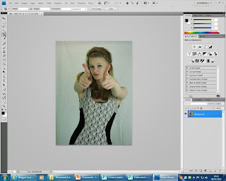 Throughout making my media product I used Photoshop to construct the magazine pages. One technology I used for the construction of the front cover of the magazine was the crop tool. I used the crop tool to remove the top of the image I used for my cover star, this enabled me to take into account the rule of thirds, allowing my audience to connect with the cover star and allowing the cover star to attract the audience's attention, because her eyes are in the top third which will focus the reader's attention. The crop tool was easy to use as I just selected the tool from the tool bar on the left hand side and highlighted the area I wanted to keep, then I clicked the tick at the top of the page, which produced my cropped product.
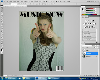
 Photoshop also allowed me to add text to my media product by using the text tool, this was easy to use as Photoshop has the text tool on the tool bar on the left hand side. When you click on the text button you can draw a text box easily, this tool then allowed me to choose the font of the text, for example for my masthead I used Broadway. The text is automatically black, however it can be changed by using the colour tool, however this was not necessary for my masthead, so I left the font black, however I used the text tool again to increase the size of my font to make the masthead stand out to the audience, so that it would grab their attention and persuade them to buy the magazine.
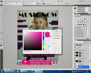 While making my media product I also learnt to use the colour tool on Photoshop, this enabled me to change the colour of certain texts, boxes and other auto-shapes. This was also a simple tool to use; firstly I selected the layer from the layer box on the rightt hand side of the page and clicked on the colour box at the top of the page, I then chose a certain colour from the box shown. I could also choose exactly the same colour as another object by using the eye dropper tool, this allowed me to copy a colour so that the colours match identically.
Eye Dropper tool:


The colour selecter was also easy to use as I could choose which colour I wanted from the bar at the side and then change the colour slightly to suit the genre of the magazine by the larger coloured area, for example I could use this part to make a darker or brighter pink, however I would use a brighter pink as this links into my pop/chart-based music/fashion magazine.
By using the layer box, I could choose which text/shape I want to change the colour of easily and more efficiently.
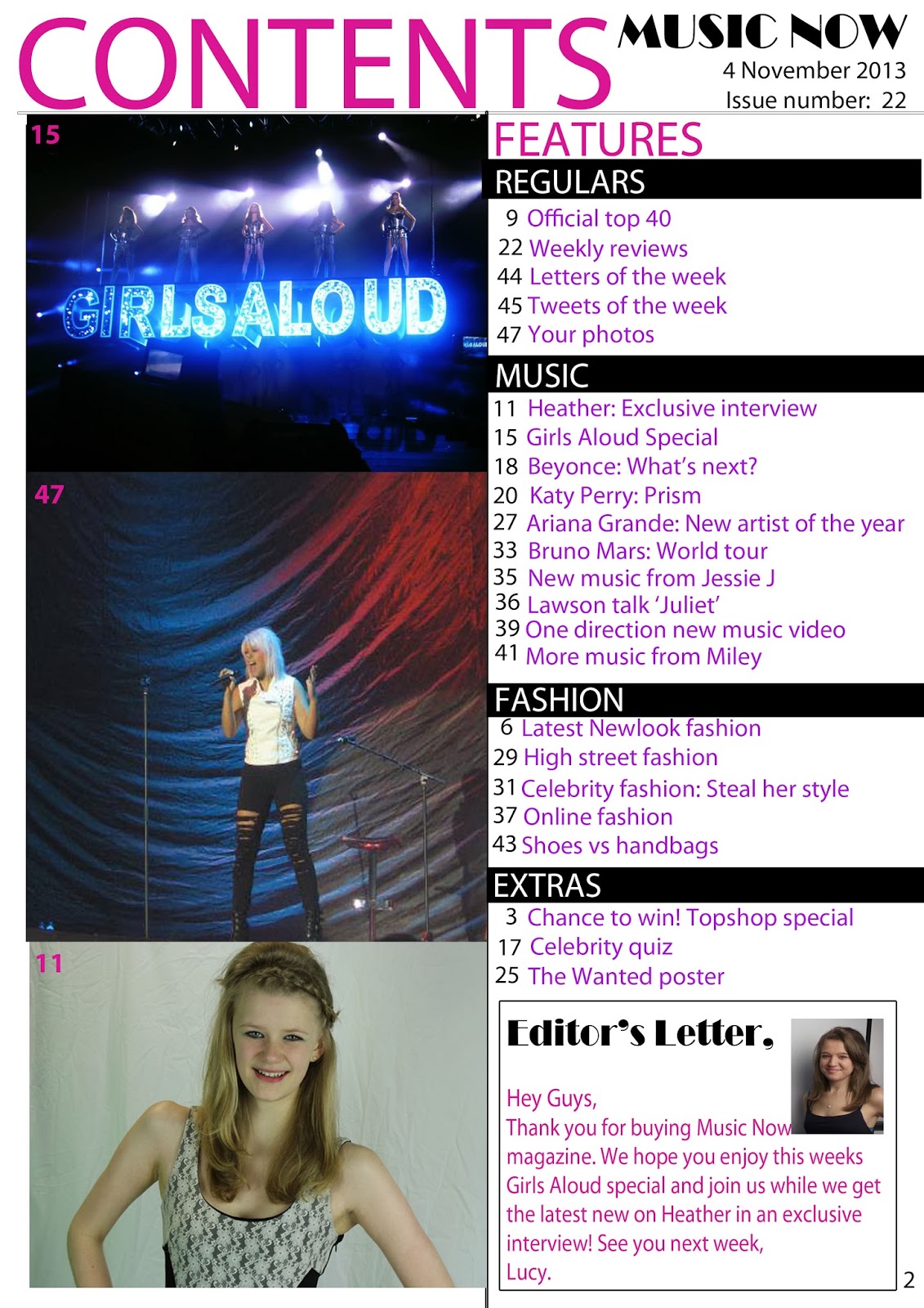
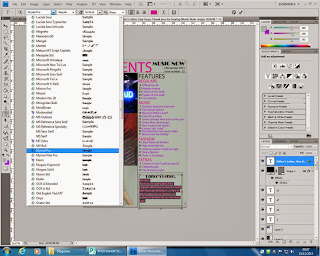 I also used the text tool on my contents page, however I used different fonts and colours. To change the font of a piece of text I had to select the layer first, and then highlight the text, then I could choose a font, size and colour that would suit my magazine.
 On my contents page I also added boxes, for example for my editor's letter, or banners which were put on later; these were added by using the box tool. Firstly I clicked on the box and then drew the box with the box tool.
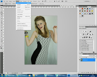 For my double page spread I added images by opening the image on a second page and pressing 'select all' this then allowed me to copy the layer and paste it onto my double page spread. After copying my image onto my double page spread, I realised that my image did not look very professional as it showed crease marks in the background from the shite sheet which was behind the model when taking the image. To make the image look more professional I opened the image again separately to remove the background and create a new background, after creating the new background I selected the image again and copied it back onto my double page spread.
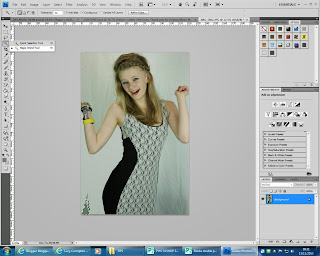 To remove the background from the image I used the magic wand tool on Photoshop which allowed me to select the backgroung around the model, without deleting part of her dress or arm, etc. Instead of having no background I decided to colour the background grey to match the rest of my magazine and continuing the house style.
After using the magic wand tool I found that some edges of the model were not as neat as possible, for example around her hair. To fix this I used the smudge tool on Photoshop, which allowed me to smudge the models hair creating a neater edge, furthermore making the image look more professional and realistic.
Smudge tool in progress:
Before:
After:

Finally I changed the background of each of my pages using Photoshop I did this to make the pages look brighter, and to make them fit better with my magazine. To change the background of the pages I used the magic wand tool again to select the background that I wanted to change the colour of. I then deleted the background and used the paint bucket to change the colour to white.


No comments:
Post a Comment