Saturday, 28 December 2013

Evaluation: Question 6: What kind of media institution might distribute your product?

I will choose to make my magazine a sister publication to Seventeen Magazine using Hearst Corporation as the publisher, however I will also challenge Billboard Magazine as I will make my magazine their rival company. I think my magazine will be successful if it is published by Hearst Corporation, because Seventeen Magazine is a successful magazine and focusses on chart based music as well as fashion. Although Billboard Magazine is also a chart based music and fashion magazine the company focusses much more on music and fashion isn't really seen as part of a hybrid-genre; therefore I think that my magazine will also be successful if it is Billboard's rival company, because I think that stealing this magazine's audience will be easier than stealing Seventeen's because the audience of Billboard may be interested in fashion, however Billboard does not satisfy these needs of the audience, whereas my magazine will satisfy both the musical needs and fashion needs of the audience, making my magazine stand out compared to Billboard Magazine.

My magazine will be published weekly, as it appeals to mainstreamers who will expect to see new fashion and new music regularly, as they enjoy seeing the most recent and up to date things. Therefore my target audience will not be happy with monthly issues, because songs and fashion changes to regularly for a monthly magazine. The cost of my magazine will be £1.80, because the magazine is aimed at a younger age group, the majority being students who may not have that much money, therefore they will not want to spend all of their money on a magazine, meaning the magazine has to be reasonably priced. My magazine will also only be £1.80 because it is published so often, therefore if it is cheaper more readers will buy it every week.

On my magazine front cover I have included a masthead and tagline to create brand identity. The masthead and tagline will appear on each issue of the magazine so that the reader will associate this font and text to the magazine. The masthead will always be in the same font making it recognisable to the audience, this will create brand identity, because the reader will notice the mastheads font and relate it to the brand of the magazine. My tagline will also help create brand identity, because it is short and memorable, therefore the audience will be able to remember the tagline easily and quickly relate it to the magazine. I have also used my masthead on my contents page, which also creates brand identity because it reminds the audience of the masthead and ensures they remember the magazine and the brand.

On my magazine front cover I have included social networking sites, a website and a downloadable app to create multi media platforms for my magazine. This also allows my audience to find my brand in other ways than my print based publication. The social networking sites create a symbiotic relationship and allows my readers to interact with the magazine and other readers by 'tweeting', etc. The use of twitter encourages brand loyalty, because it allows the audience to connect with the magazine, because they can 'tweet' and 'follow' the magazine and they can also use hashtags that link to the magazine, allowing them to interact with the magazine. Instagram allows the reader to send in pictures to the magazine which could appear in the magazine, for example in the 'Your Pictures' pages, this creates audience loyalty because the reader may continue to send in pictures so that they can get their pictures in the magazine, therefore they will continue buying the publication so that they can see if their image has been used. Facebook also allows the reader to connect with the magazine, because they can 'like' the page and read posts and updates on the magazine, therefore they will be more connected to the magazine, encouraging brand loyalty because they will feel more involved in the magazine so they will feel like they are a part of the magazine and will want to continue supporting the magazine. YouTube also allows the reader to connect with the magazine, because it encourages the reader to send in videos and watch music videos online that link to the chart based music genre, creating brand loyalty because they will continue to watch these types of videos.

 My reader can also visit the website that is shown on the banner at the bottom of the magazine front cover, here the reader can read more about the articles or watch online interviews, etc. The downloadable app also allows the reader to find the brand without using the print based publication, as the reader can find the app on their phone/tablet/etc. They can then use the app whenever and wherever they want. This encourages brand loyalty, because the audience can look for new fashion and great songs on their app which is the magazine's recommendations and opinions. The use of an app will also encourage brand loyalty, because they will have downloaded the app to their mobile/etc, suggesting that they will be using the magazine and app more than once. On my magazine front cover I have also encourage brand loyalty by persuading the audience to subscribe to the magazine, this will encourage brand loyalty because if they subscribe they will get the magazine weekly and furthermore using the magazine for lifestyle choices will become a habit,
On my double page spread I have also included my magazine's website to allow the audience to visit the magazine online. This also persuades the audience to go online, because it reinforces the idea of an online publication (also shown on the front cover) and therefore will encourage the audience to visit the website. 


Another way I will continue to get readers is by including merchandise such as wristbands, t-shirts, etc. The merchandise could be advertised throughout the magazine's print based version, and can also be advertised on the magazine's website, where I will create a 'Shop' feature where the audience can buy merchandise and other items that the magazine will be selling, for example concert tickets, etc. The merchandise will appeal to the target audience because they will have links to the reader's favourite artistes and bands, therefore the audience will want to buy posters or t-shirts that show who they support. Also the merchandise could include signed pictures, etc. that the audience will want to buy because they have been signed by someone they look up to, admire and who they find interesting.

Monday, 23 December 2013

Evaluation: Question 5: What have you learnt about technologies from the process of constructing this product?


Crop Tool:
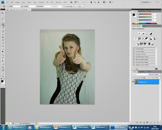
 Throughout making my media product I used Photoshop to construct the magazine pages. One technology I used for the construction of the front cover of the magazine was the crop tool. I used the crop tool to remove the top of the image I used for my cover star, this enabled me to take into account the rule of thirds, allowing my audience to connect with the cover star and allowing the cover star to attract the audience's attention, because her eyes are in the top third which will focus the reader's attention. The crop tool was easy to use as I just selected the tool from the tool bar on the left hand side and highlighted the area I wanted to keep, then I clicked the tick at the top of the page, which produced my cropped product.


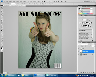
Photoshop also allowed me to add text to my media product by using the text tool, this was easy to use as Photoshop has the text tool on the tool bar on the left hand side. When you click on the text button you can draw a text box easily, this tool then allowed me to choose the font of the text, for example for my masthead I used Broadway. The text is automatically black, however it can be changed by using the colour tool, however this was not necessary for my masthead, so I left the font black, however I used the text tool again to increase the size of my font to make the masthead stand out to the audience, so that it would grab their attention and persuade them to buy the magazine.

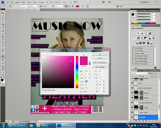
While making my media product I also learnt to use the colour tool on Photoshop, this enabled me to change the colour of certain texts, boxes and other auto-shapes. This was also a simple tool to use; firstly I selected the layer from the layer box on the rightt hand side of the page and clicked on the colour box at the top of the page, I then chose a certain colour from the box shown. I could also choose exactly the same colour as another object by using the eye dropper tool, this allowed me to copy a colour so that the colours match identically.
Eye Dropper tool: 


The colour selecter was also easy to use as I could choose which colour I wanted from the bar at the side and then change the colour slightly to suit the genre of the magazine by the larger coloured area, for example I could use this part to make a darker or brighter pink, however I would use a brighter pink as this links into my pop/chart-based music/fashion magazine.
By using the layer box, I could choose which text/shape I want to change the colour of easily and more efficiently.
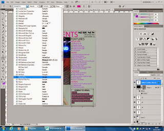
I also used the text tool on my contents page, however I used different fonts and colours. To change the font of a piece of text I had to select the layer first, and then highlight the text, then I could choose a font, size and colour that would suit my magazine.
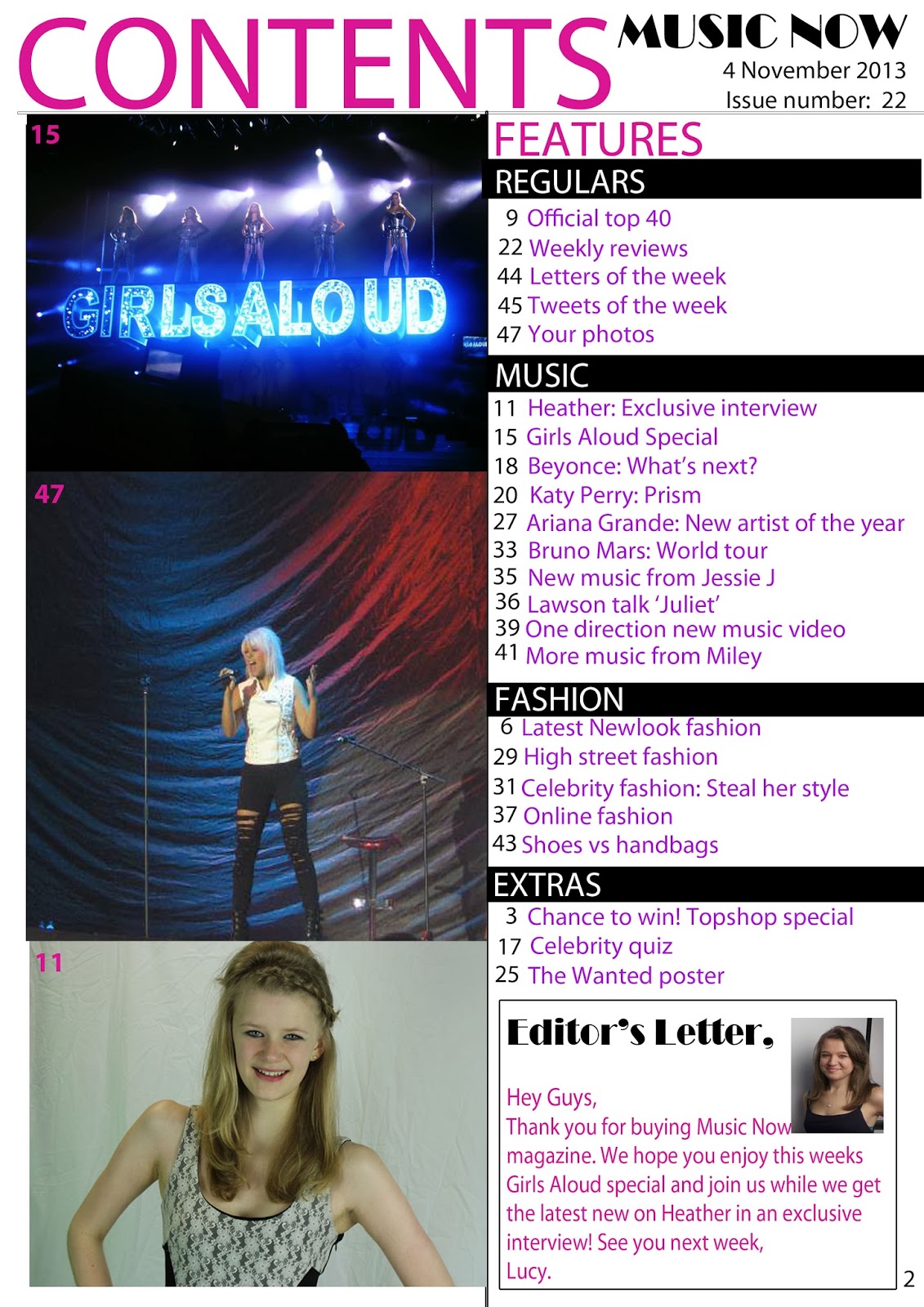
On my contents page I also added boxes, for example for my editor's letter, or banners which were put on later; these were added by using the box tool. Firstly I clicked on the box and then drew the box with the box tool.

Box tool:
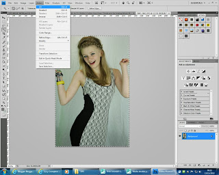
For my double page spread I added images by opening the image on a second page and pressing 'select all' this then allowed me to copy the layer and paste it onto my double page spread. After copying my  image onto my double page spread, I realised that my image did not look very professional as it showed crease marks in the background from the shite sheet which was behind the model when taking the image. To make the image look more professional I opened the image again separately to remove the background and create a new background, after creating the new background I selected the image again and copied it back onto my double page spread.
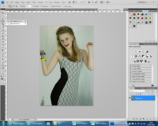
To remove the background from the image I used the magic wand tool on Photoshop which allowed me to select the backgroung around the model, without deleting part of her dress or arm, etc. Instead of having no background I decided to colour the background grey to match the rest of my magazine and continuing the house style.
After using the magic wand tool I found that some edges of the model were not as neat as possible, for example around her hair. To fix this I used the smudge tool on Photoshop, which allowed me to smudge the models hair creating a neater edge, furthermore making the image look more professional and realistic.
Smudge tool in progress:
Before:


After:


Finally I changed the background of each of my pages using Photoshop I did this to make the pages look brighter, and to make them fit better with my magazine.  To change the background of the pages I used the magic wand tool again to select the background that I wanted to change the colour of. I then deleted the background and used the paint bucket to change the colour to white.


Wednesday, 18 December 2013

Evaluation Question 3: How does your media product represent particular social groups?


 IDEAL READER:

The ideal reader for my magazine would be a young girl who is interested in chart based music and fashion. My cover star helps to demonstrate my ideal reader, because she looks happy and she is wearing a dress which fits into the chart based music/fashion hybrid genre. My target audience should aspire to be like her, as she is an idealised version of the reader and also looks happy and seems to be a perfect role model for young girls who enjoy pop/chart-based music. The cover star appears to be mainstream, as the clothing could appeal to a variety of people and a positive facial expression means many people will aspire to be like the cover star, this also allows a wider audience and makes the magazine appeal to as many consumers as possible.

MODE OF ADDRESS:

By knowing my ideal reader, I have created a mode of address and relationship between the magazine and the audience by using quite short simple words that will appeal to the young target audience. This creates a positive relationship between the reader and the magazine, because the reader will find the magazine easy to read, and allowing them to enjoy the magazine.

Cover Star

The cover star is used as an inspiration to the reader and targets the reader as an individual to draw them into the magazine. My cover star is successful in representing particular social groups as she is the same age and gender as the ideal reader, which helps to attract the reader and allows them to see how they should aspire to be.
The image helps to represent the mainstream social group, as the cover star is shown to be a popular artiste and allows the reader to see that being in the mainstream social group will bring happiness, because of the positive facial expression that the cover star shows.


My cover star is wearing a dress which would be suitable for a party or concert, this shows that the cover star cares about her looks, and shows that the social group associated with the magazine are represented in a positive way. My cover star is wearing plain colours which makes her less noticeable, which shows that the ideal reader does not need to feel the need to 'stand out from the crowd' so the reader looks up to the cover star as a role model.


Taylor Swift is an example of an artiste that will be featured within my media product. On the red carpet Taylor Swift is seen as an elegant and powerful artiste that young girls would aspire to be like. She is wearing a long white dress which represents her importance, also the connotations of white are purity, innocence and beauty, which makes her a suitable role model for young girls. With her hand on her hip she seems more powerful, which makes her look 'the part' of a red carpet experience. Taylor Swift also has her hair neatly done up and a positive facial expression, which makes her a positive role model for young girls, as they will want to look as elegant and be as happy as her, therefore aspiring to be like her.

This differs from the image of Taylor Swift performing live, because she no longer seems to be the elegant, innocent lady she seemed like on the red carpet. In this image her hair is not neatly done up, but instead her hair is wild and seems to be un-brushed with curls falling over her face. This appeals to the audience, because it shows she is having fun while she performs and also makes her seem like a positive role model. Taylor has also got a short sparkly dress on showing Taylors 'other side' and showing the audience that she is fun which will make her music and the live experience more appealing to younger audience's. In this image the artiste is also wearing boots, showing the country side to her music which represents particular social groups by showing her background and allowing the audience to connect with the artiste and her lifestyle.


Throughout my media product the cover star is shown to be a positive role model. The star is also seen to be happy in each image which represents the particular social group for my media product as well behave individuals with a positive attitude. The artiste is also seen as a 'sweet' and 'innocent' young girl, which represents the audience in a positive light, and gives the reader a positive role model and someone to look up to. I have also tried to make the main star of the magazine appear similar to the ideal reader, for example the star has quite subtle make up on creating a 'girl-next-door' look which the audience should aspire to be like, because they will want to look like her, because she is on the cover of a magazine, and her success makes her a positive role model, which will encourage the audience to try to do the same.


Evaluation: Question 2: How did you attract/address your audience? (Double Page Spread)

DOUBLE PAGE SPREAD
One way I have attracted my audience is by making the page look professional and easy to read. One way I have done this is by the layout of my text; the text has been put into columns, this makes the page look professional as all text in magazine's features pages and newspapers are put into columns. The columns also make the text easy to read which will attract my audience, because my audience are quite young, and therefore are looking for a magazine that is fun to read and so they will not want to read big chunks of text, therefore columns will suit them better. I have also used a dropped cap at the start of the article, making the article easy to read as this shows the reader that this is where the article starts, the dropped cap also makes the page look professional, because it is a convention that the audience expect to see, and therefore will attract the audience to the article encouraging them to read it.

Another way I have attracted my audience on my double page spread was by including a main image that immediately grabs the reader's attention. I decided to make the main image the size of a full page, because my magazine is targeted at young girls who will not like a page full of writing, therefore the picture makes the page more exciting and furthermore will appeal to the audience. I have also chosen a fun image that will attract the audience, because the artiste is smiling on the image and her facial expression looks happy, and as though she is having fun. This will attract the audience, because it will make the reader think that the article will be fun to read, persuading them to read the article.
I have also used a pull quote over the main image to draw the reader into the article. The pull quote is in a brightly coloured, bold font which stands out to the reader and grabs their attention. This will also attract the reader, because the bright purple links to the house style and idea that this is a 'girly' magazine, also making the target audience obvious. The pull quote also includes a well-known artiste which may also attract the audience, because they may know this singer and may be more likely to read the article because of this. The way the pull quote has been positioned on the page makes the magazine more informal, which may make the reader feel more comfortable with the magazine.


I used a bold heading to attract the audience, as this will be one of the first things the audience will read on this page. I used upper case letters for the heading to grab the reader's attention and make this stand out from other text on the page. The bright purple also helps attract my audience, because my magazine is aimed at young girls who will like bright, 'pretty' colours, like purple. The heading is positioned at the top of the page, so that it will attract the audience straight away so that they know who the article is about.


My audience will also be attracted to the double page spread by the use of a stand first at the start of the article, welcoming the audience into the story and giving a brief description. I have also used capital letters for the stand first to express the importance of the stand first to the reader, encouraging them to read this. For the stand first I used a bright pink colour which relates to pop music and attracts my audience, because the connotations of pink are: love and happiness, and pink is also seen as a 'girly' colour which will appeal to my target audience, as they are girls of a young age. I have also encouraged my reader to read the article by using ellipsis at the end of the stand first, as this draws them into the story and suggests there is much more information which will interest the audience, and suggests the interview is worth reading.


I have also included a secondary image within my columns on my double page spread which will help to attract my audience. My target audience is young girls, therefore they are looking for a magazine which is fun to read and which they will enjoy; furthermore my audience will not want a page to be full of text, suggesting that they would be looking for images to break up the text and make the page look more enjoyable to read.
The use of a secondary image will also attract the reader, because on the image the artiste is smiling, showing that she is happy. This will attract the reader, because they will judge the article on the images, and so when they see that the artiste is happy they will think that the article will be fun to read which will make them want to read the article.


I have also split up the text by including a pull quote in the middle of one of the columns. This will attract the audience, because it has successfully broken up the text making the article more fun to read. The use of a pull quote will also attract the audience, because it leads the reader through the article and gives the reader an insight to the interview before they start to read it, allowing them to be drawn in and enabling to decide if this is the type of article that they will want to read. I have made the text for the pull quote bigger than the main text to allow the reader to notice this straight away, allowing them to read the pull quote before the reading the article as a whole. I also chose to use a different colour for the pull quote (purple) so that it stands out from the rest of the text - however still following my house style - so that my audience will be attracted to the pull quote which will help encourage the reader to read the full interview.


On my double page spread, I have included a
grey box containing extra information. This will attract the audience because it includes a web address that offers the reader the 'latest news' this will also appeal to the reader, because it may include extra information about this interview and many more artistes and bands that the target audience will be interested in. The colours used for the grey box will also attract the reader, because they are bright and eye-catching and contrast with the background. This enables the reader to notice the grey box and may lead them to visit the website and read the 'latest news'.

After making my double page spread, I decided to make my page brighter by changing the background to white, also keeping to the house style making the background the same as the other pages. I also decided to add more secondary images to fill up the page and make the page look more fun for the audience to read.
On the two secondary images behind the main image I also decided to change the brightness of the images to make them different from the main image, this continues to make the main image stand out from the other images, because although it is duller it is bigger and different from the others showing the reader that this is the most important image on this page.