Aquinas Magazine front cover:

Final magazine front cover:

I think that my magazine front cover has improved since my preliminary work, as I was able to use Photoshop allowing me to change the background and improve previous ideas, for example in both magazine front covers I included social networking site logos, however in my second front cover the logos look more professional because using the magic wand tool on Photoshop I was able to fully crop out the white background. I have also used up all the spaces on my second front cover, which will create more readers, because the page looks full and has more features.
Aquinas Magazine contents page:

Final magazine contents page:
I also think that my contents page has improved since my preliminary work, because I have used the idea of brand identity to encourage more readers. One way I have done this is by including the masthead of the magazine on the contents page, so that the reader can relate to the font and so that it becomes recognisable to the reader encouraging brand loyalty. I have also used banners in my more recent contents page which will highlights each category of features helping the reader to find the pages they want more easily. I have included an editor's letter in both magazine contents pages, however I think that this has also been improved, as I have decided to target the audience by my editor's letter, as well as house style, features, etc. I think that my editor's letter on my final magazine contents page will appeal to my target audience more, because I have used informal language, such as 'Hey Guys' which makes the reader feel equal and comfortable with the magazine.
Final magazine double page spread:

Evaluating my college magazine:
For my college magazine I used a digital camera to take the pictures used, and Microsoft Publisher to create the pages.
FRONT COVER:
 The masthead of the magazine is in the same font of the college logo which helps to create the idea of brand identity. The magazine front cover also has the issue date and number in the top right hand corner, clear for the reader to see. The price of the product is also at the top of the magazine, which allows the reader to find it easily so they know how much the magazine will cost. The magazine also creates brand identity with the use of the tagline. 'College entertainment' is a short tagline, therefore it is easy to remember which makes the tagline recognisable to the magazine, further developing the idea of brand identity.
I have used a bright colour for my cover features and I have also used capital letters to make the features stand out to the reader, because cover features are the codes and conventions that the audience will be attracted to and they are what will encourage the reader to read inside. I have also decided to include a brief description of each cover feature below so that the reader can read more about the features before buying the magazine; I have used a white font for this which is smaller than the font for the cover features, because the description is less important.

 I have also included free giveaways to create audience appeal, for example I have included a free poster inside the magazine to encourage the reader to buy the magazine. I have also included competitions which will appeal to the audience as they will want to win the iPad Mini, as they are young teenagers and so I have included prizes which would appeal to them, and therefore will persuade them to buy the magazine.
The cover star is looking directly at the camera, creating a direct gaze which focusses the audience's attention onto the cover star and draws them into the magazine. The cover star also helps to focus the audience's attention, because the background of the front cover is plain creating negative space which forces the audience to acknowledge the cover star. The cover star is also wearing plain casual clothes which links to the idea of a college magazine, as the cover star is an idealised version of the reader, therefore the cover star makes the target audience, as it is clear that she is a college student by the way she looks and the way she is dressed. The cover star has a positive facial expression, which encourages the reader to buy the magazine because it suggests that the magazine is fun as the cover star looks happy, also suggesting that the reader will be happy to read the magazine.
 I have also created anchorage on my college magazine front cover by including a cover line that links to my cover star. The cover line is in capitals and in a bright coloured font (white) which highlights the importance of the cover star, and ensures the reader knows that this is the main cover feature. I have also included a strap line above the cover line which anchors to the image, as this explains the cover line and encourages the reader to want read this particular article.
 The use of social networking sites and a website at the bottom of the front cover allows the reader to connect with the magazine and creates a symbiotic relationship. This also creates audience appeal because the readers are students which will be attracted to websites and social networking sites, because they are interested in technology. A web-address also creates multi-media platforms which allows the reader to access the magazine through more than one way, allows them to become a loyal reader by using the website and not just the print based publication.
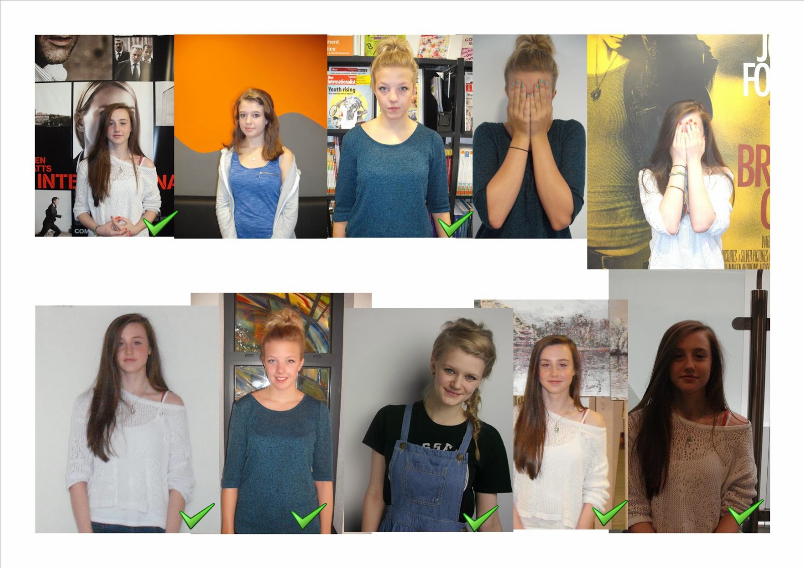
I decided to use the eighth image because there is a plain background, so that the full attention of the reader is on the cover star. Also, the cover star is looking directly at the camera creating a direct gaze, which allows the reader to connect with the cover star. Although I liked the first image I decided that it was not suitable for the front cover of my magazine, because there was no evidence of the rule of thirds like the image I finally chose, and without the rule of thirds being taken into account the images do not look as professional. Although I could create the rule of thirds on the first image by cropping the image, I still do not think it is suitable for the front cover because the background is too busy, therefore taking attention off the cover star.
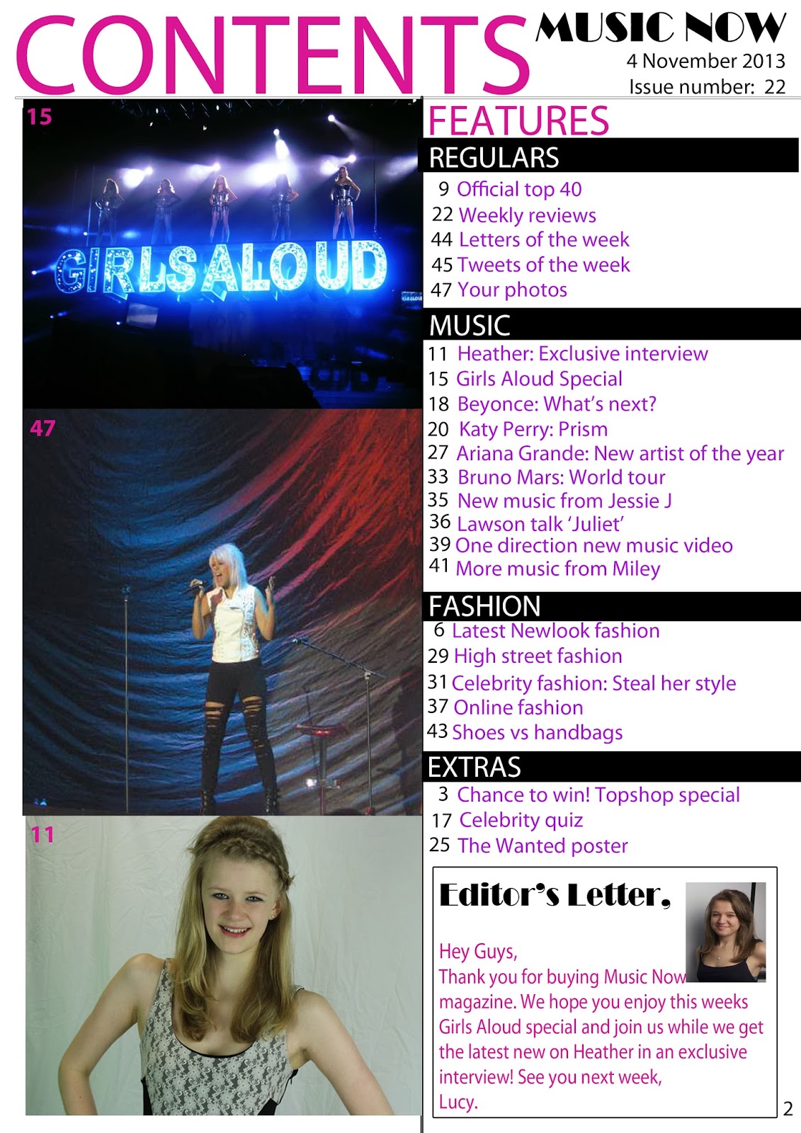
CONTENTS PAGE:

I have also included a variety of features that have clear categories so that the reader can find the features they want easily. I have also used the same colours as the front cover and the rest of the magazine to create a house style, which links to the typical reader. The page numbers are in red to stand out from the text, allowing the reader to find the page they want easily, as the magazine is supposed to be fun to read. By splitting the features into 'regular' features and 'this issues' features the audience can see what type of things are usually in the magazine and what is new each issue.
 I have also included a chance to win box on the contents page to encourage the reader to read that page and continue reading the magazine to see if there are more prizes available, etc. The 'chance to win' also connects to the front cover of the magazine as it has been repeated, reminding the audience that they have a possible chance of winning a prize that they would want.
 The main image of my contents page also connects to the front cover, which shows the reader that this is the main feature of the magazine and reminds the reader of the cover star. I have also included a page number on each of the images on the magazine's contents page so that the reader can find a page from the images shown. To show that this is the main image of the page I have made this bigger than the other images, focussing the reader's attention on this particular image and reminding them that this is the main feature of this issue.

I also included secondary images on my contents page to make the page look more fun to read, and persuade the reader to read on. The secondary images also have page numbers to help the reader find the pages easily.

To create audience participation on my contents page I also included a subscription box. This allows the audience to become a part of the magazine and also ensures brand loyalty, as they will continuously get news and updates from the magazine.

At the bottom of my contents page I have included an editor's letter to connect with the reader and persuade them to buy the magazine again; creating brand loyalty. For the editor's letter I have used quite simple language so that the reader finds it fun and simple to read. I have also included an image of the editor on the editor's letter so that the reader will feel a part of the magazine and will feel as though they know who has written the magazine that they are reading.
MUSIC NOW MAGAZINE:
For my second magazine I used a digital camera to take the images used, and I used Photoshop to put the magazine pages together.
FRONT COVER:
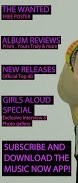 I have also included a variety of features on my front cover to interest the reader and encourage them to buy the magazine. Like my Aquinas Magazine I have given a brief description of each feature underneath. However I have made my features stand out more by highlighting them with boxes. I have also kept to my house style by using colours that will create audience appeal as my target audience will like pinks and purples, because I have aimed my magazine at younger girls. I have also caught the readers attention by including a subscription box and a downloadable app. This encourages brand loyalty because the reader will be paying for the magazine and so will get the magazine delivered to them each week. The downloadable app also creates a multi-media platform and allows my target audience to access the magazine in other ways rather than just the use of a print based publication.


The cover line of my Music Now magazine anchors the image of the cover star, because the cover line is about the star. The cover star is facing the camera directly and creates direct gaze to focus the reader's attention and make them feel equal to the cover star. I think that this image is better than the image I used for my Aquinas magazine, because the cover star is pointing towards the audience, which draws the audience in and persuades them to buy the magazine. The cover line stands out, because of the contrast between the black box around the text and the bright pink writing that will focus the reader's attention. I have also included a strapline below the cover line to explain that the feature is an interview.

On my contents page I included three images with the page numbers next to each so that the reader can find each page easily. I also decided to put the heading at the top of the page, so that as soon as the reader turns to this page they will see it is the contents page. On my contents page I also decided to create brand identity by including the masthead of the front cover in the top corner with the issue date and number. This will help create brand identity, because the font will become recognisable and so every time the reader sees this font they will associate it to the magazine.
 I have also continued to create a house style on my contents page by using the same colours as I have used on the front cover. For the Features subheading I have used a bright pink colour so that it is easy to see and I have also used blocked capitals to make the text stand out.
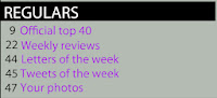 For each of the features categories I have used banners to make the category name stand out. I have also used blocked capitals for this to catch the reader's eye and encourage them to look at each category of features. I have then used purple text for each feature with black page numbers next to each feature, this allows the reader to find each page quickly and easily, and will therefore encourage them to buy the magazine again.

MUSIC NOW MAGAZINE:
For my second magazine I used a digital camera to take the images used, and I used Photoshop to put the magazine pages together.
FRONT COVER:
Ideas for the masthead of my chart based music magazine:
MUSIC NOW Times New Roman
MUSIC NOW Arial black
MUSIC NOW Bookman Old Style
MUSIC NOW Britannic Bold
MUSIC NOW Broadway
I chose to use Broadway font for my magazine, as it fits in with the idea of chart based/pop music as it will appeal to a younger audience, because the font looks fun and eye catching.
MUSIC NOW Felix tilting
MUSIC NOW Goudy Stout
MUSIC NOW Haettenschweiler
MUSIC NOW Rockwell Extra Bold
MUSIC NOW Stencil
MUSIC NOW Veranda
The big, bold masthead stands out to my target audience as it is clear and easy to see. This is used at the top of the page so that the reader will know what the magazine is called as soon as they pick it up. I have also included the price, date and issue number at the top of the page so that it is easy for the reader to find. I have included a short tagline under the masthead which creates brand identity, because the reader will remember the tagline because it is short and simple, and when they see this tagline they will then associate it to Music Now Magazine.
I have also included a variety of features on my front cover to interest the reader and encourage them to buy the magazine. Like my Aquinas Magazine I have given a brief description of each feature underneath. However I have made my features stand out more by highlighting them with boxes. I have also kept to my house style by using colours that will create audience appeal as my target audience will like pinks and purples, because I have aimed my magazine at younger girls. I have also caught the readers attention by including a subscription box and a downloadable app. This encourages brand loyalty because the reader will be paying for the magazine and so will get the magazine delivered to them each week. The downloadable app also creates a multi-media platform and allows my target audience to access the magazine in other ways rather than just the use of a print based publication.
I have also chosen to include a pug on my magazine front cover to appeal to the target audience. However I have included a prize that will definitely appeal to my target audience and also something that will fit in with my magazine. My magazine has a hybrid genre of chart based music and fashion, therefore a Topshop voucher will definitely appeal to my target audience, because they will be interested in a certain type of fashion, mainstreamers fashion, and so will shop at popular shops like Topshop. The pug also uses the Topshop logo which will appeal to my target audience, because they will notice the logo straight away, and will therefore be interested in winning the voucher. I have chosen to use pink to make the pug stand out, as this fits in with my house style but is also a bright colour which will immediately catch the reader's attention.

The cover line of my Music Now magazine anchors the image of the cover star, because the cover line is about the star. The cover star is facing the camera directly and creates direct gaze to focus the reader's attention and make them feel equal to the cover star. I think that this image is better than the image I used for my Aquinas magazine, because the cover star is pointing towards the audience, which draws the audience in and persuades them to buy the magazine. The cover line stands out, because of the contrast between the black box around the text and the bright pink writing that will focus the reader's attention. I have also included a strapline below the cover line to explain that the feature is an interview.
At the bottom of my front cover I included a banner so that I could include social networking sites and a web address. These create audience participation and synergy. The use of social networking sites could also help to increase positive word of mouth, because people may 'follow' or 'like' the magazine and then they may 'tweet' or 'post' about it with their friends or other people who read the magazine. I have also included extra features on my banner to encourage the reader to buy the magazine. By including more artistes and bands that the audience will be interested in, I am persuading the audience to buy the magazine, because they will want to read about each of their favourite artistes.
CONTENTS PAGE:
On my contents page I included three images with the page numbers next to each so that the reader can find each page easily. I also decided to put the heading at the top of the page, so that as soon as the reader turns to this page they will see it is the contents page. On my contents page I also decided to create brand identity by including the masthead of the front cover in the top corner with the issue date and number. This will help create brand identity, because the font will become recognisable and so every time the reader sees this font they will associate it to the magazine.  For each of the features categories I have used banners to make the category name stand out. I have also used blocked capitals for this to catch the reader's eye and encourage them to look at each category of features. I have then used purple text for each feature with black page numbers next to each feature, this allows the reader to find each page quickly and easily, and will therefore encourage them to buy the magazine again.
Like the Aquinas Magazine I have also decided to include an editor's letter at the bottom of my contents page to encourage brand loyalty and make the reader feel welcome and comfortable with the magazine. I have used the same font as my masthead for the title of the editor's letter to make the reader associate this font with my magazine. I have also kept to the house style by using pink text, which will also persuade the reader to read the editor's letter, because the text is bright. My editor's letter is very informal and makes the reader feel equal to the magazine writers, as it is written in a chatty, friendly way. I have also used an image of the editor to make the reader feel like they know the writers and are a part of the magazine.
No comments:
Post a Comment