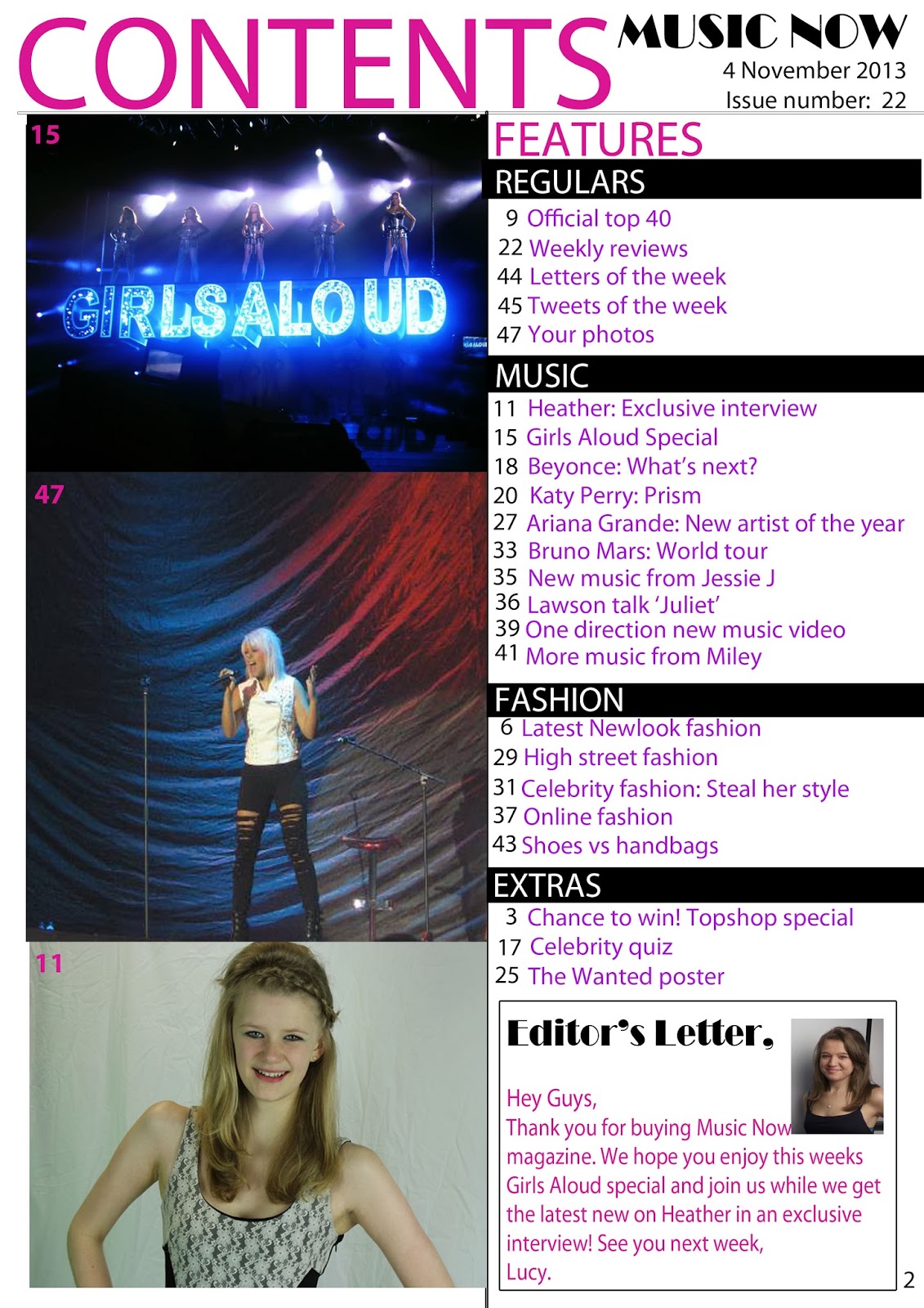

My magazine contents page is similar to Billboard Magazine's contents page, because both magazines have the heading: 'Contents' at the top of the page, this clearly shows the reader what the page is, and grabs their attention straight away. Both magazines also have the word 'Contents' in blocked capitals to stand out to the reader and show them that the heading is important. The pages are also similar as the name of the magazine and the date of issue is written in the top right hand corner, this shows the magazine is proud to have their logo on the contents page, and also shows the reader the date of issue clearly so that they know exactly when this issue came out, these are also used on the contents page to make the magazine look professional and official. My contents page is also similar to Billboard Magazine's contents page, because both have images of what is in the magazine with numbers in the corner to show the audience which page they can find these images on, therefore making them easier to find. On my magazine I have also included page numbers next to my features and I have used subtitles for the features to make the page more organised and professional, this is similar to Billboard Magazine, because this magazine has also used subtitles for the features such as music, etc.
My magazine contents page differs from Billboard Magazine's contents page, because I have included an editor's letter to welcome the reader into the magazine, and persuade them to buy the magazine's next issue. Billboard Magazine has also chosen to use one main image on the contents, this is different to my contents page because I have chosen three images and no main image, this is because one of my images relates to the front cover so the audience will relate this to being the main feature. I have also used banners on my contents page to highlight the subtitles of the features, Billboard Magazine has also used a banner, however they have only used one to highlight the word: 'Contents'. I think the use of banners is effective, because it makes the text stand out and draws the attention of the audience.
No comments:
Post a Comment