Thursday 28 November 2013

Evaluation: Question 1 Who would be the audience for your media product?


My media product will be aimed at a mass audience of teenage girls, this is because from my questionnaire results I have found the most common clothing store to shop was Topshop which is highly popular with young females. Also all types of music was very popular, showing that a chart based magazine would be most preferred, which would appeal to teenage girls. From the questionnaire I also found that most people read magazines such as Cosmopolitan and Look, these types of magazines are targeted at females therefore I have decided that my magazine will also be aimed at females, however of a slightly younger age. My target audience will also be passive mainstreamers, as they will enjoy chart-based music and therefore will be influenced by the people around them and what is going on now. My audience are from groups D and E of the socio-economic scale, as it will mainly be students who are buying the magazine because it will appeal to younger people who are interested in music that is currently in the charts.
My primary audience will be teenage girls who are interested in music that is in the charts now and who are interested in celebrity lifestyle and fashion, my secondary audience would not be people who have bought the product, but people who would read it if their family members have bought it, this may include parents, siblings and friends who have borrowed the magazine.

Questionnaire results:


My target audience will enjoy chart based music and will be interested in fashion, as my media
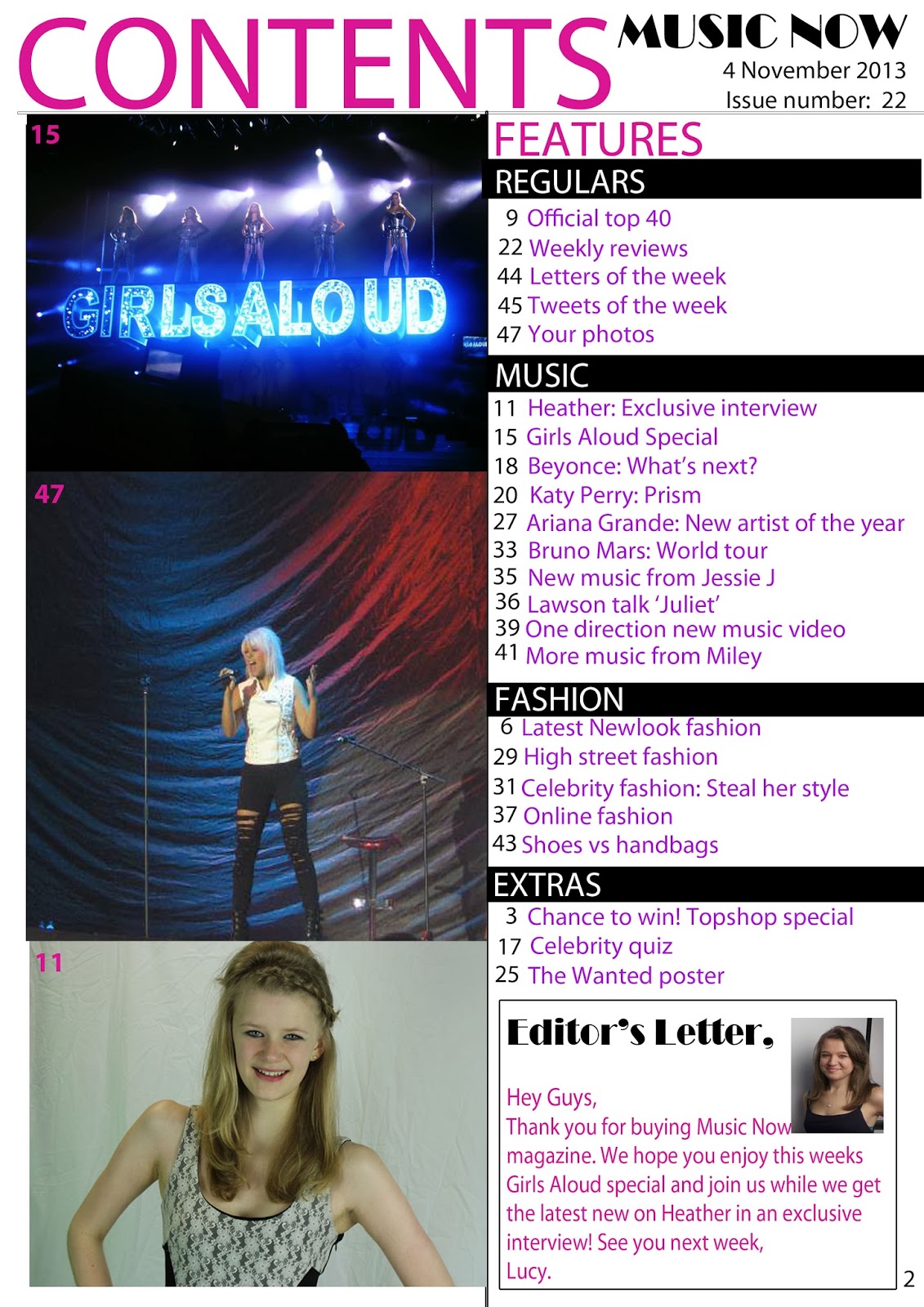
product has a hybrid genre of chart based music and fashion. My target audience should like shops such as Topshop and Newlook, because the fashion included in the magazine will be mostly around these stores. They should also be interested in artistes such as: Cheryl Cole, Bruno Mars and Katy Perry, because these are popular chart-based artistes that will be mentioned in my magazine regularly. An example of the type of things that will appeal to my target audience are shown below:
Merchandise will also appeal to my target audience, for example:


There will also be a variety of social networking sites that will appeal to my target audience, this has been shown in my questionnaire. The most popular social networking sites were Facebook, YouTube, Twitter and Instagram.
 I think that my media product would be similar to Billboard Magazine, as they share the same target audience and hybrid genre of chart music and fashion. I also believe that my product will appeal to mainstreamers like Billboard Magazine, and may also appeal to a wider range of people, as I have decided to include various artists which appeal to more than one specific group of people.     
                                

 Demographic:

 The demographic for my magazine would be mainstreamers who are interested in celebrity lifestyle, fashion and music. My biggest rival publications would be magazine such as Billboard Magazine, Seventeen Magazine and Look. Billboard Magazine and Seventeen Magazine are both mainly sold in the US making the products less of a problem to compete against, as my media product would be sold in the UK. Look magazine is also a big competitor, as it is a well-known, popular fashion magazine that is sold in the UK, to make my product stand out against Look I will focus primarily on the music so that it is different to Look, but I will also include many fashion pages to appeal to my target audience and make them more likely to buy my product. I will also offer free giveaways and prizes for competitions that will appeal to my target audience and use this as my unique selling point.
 

 Audience idols:

While making my magazine I looked at artistes that are well known in chart music, for example Katy Perry, Bruno Mars and Taylor Swift. I chose to focus on artistes like these as they appeal to my target audience as they all link to chart based and pop music. To make my magazine appeal to the audience further I decided to also include celebrities that the audience will look up to as fashion icons, for example Katy Perry has been known to influence fans on the way they dress and so I have also focussed on the fashion that these artistes have and the way they inspire fans to dress similar. On the other hand I would not include celebrities such as Arctic Monkeys, The Vaccines or Jake Bugg, because these would not appeal to my target audience as they are not in chart based/pop music meaning mainstreamers would not be influenced much by their style. Also they will not like to see artistes such as these, because they do not fit in with the genre of music.

Thursday 21 November 2013

Double page spread comparison analysis


My double page spread is similar to Billboard Magazine's double page spread, because both magazines have one main image taking up a full page, and one secondary image in one of the columns. The main image grabs the readers attention straight away and makes the double page spread look more interesting and fun to read. The double page spreads are also similar, because they both have a pull quote to draw the reader into the article. The text in both double page spreads is split into columns, this makes the text easier to read, as there is smaller chunks of text rather than a page full of paragraphs, this also relates to my target audience because they will want a page that is fun to read, therefore they are more likely to be interested in reading this page if the text is in small chunks and columns. The magazine's double page spreads are also similar as they include page numbers at the bottom of the pages making it clear to the reader which page it is on, so that the reader can find the page easily from the contents page. Both magazines have used a house style that links to the target audience, one colour that has been used is pink which relates to the target audience as the connotations of pink is 'girly' and pretty, which will appeal to young girls who are likely to read these magazines.
My double page spread differs from the Billboard Magazine double page spread, because I have included a grey box, this gives extra information to the reader, for example: I have included a website in the grey box to encourage audience participation. Another difference that is noticeable between my magazine and Billboard Magazine's double page spread is the by-line. I have included my by-line at the start of the article making it visible to the reader and easy to find. The by-line includes the name of the journalist and photographer and allows the journalist/photographer to get full credit for their work and allows the reader to see who they are.

Wednesday 20 November 2013

Contents Page Comparison Analysis


My magazine contents page is similar to Billboard Magazine's contents page, because both magazines have the heading: 'Contents' at the top of the page, this clearly shows the reader what the page is, and grabs their attention straight away. Both magazines also have the word 'Contents' in blocked capitals to stand out to the reader and show them that the heading is important. The pages are also similar as the name of the magazine and the date of issue is written in the top right hand corner, this shows the magazine is proud to have their logo on the contents page, and also shows the reader the date of issue clearly so that they know exactly when this issue came out, these are also used on the contents page to make the magazine look professional and official. My contents page is also similar to Billboard Magazine's contents page, because both have images of what is in the magazine with numbers in the corner to show the audience which page they can find these images on, therefore making them easier to find. On my magazine I have also included page numbers next to my features and I have used subtitles for the features to make the page more organised and professional, this is similar to Billboard Magazine, because this magazine has also used subtitles for the features such as music, etc.
My magazine contents page differs from Billboard Magazine's contents page, because I have included an editor's letter to welcome the reader into the magazine, and persuade them to buy the magazine's next issue. Billboard Magazine has also chosen to use one main image on the contents, this is different to my contents page because I have chosen three images and no main image, this is because one of my images relates to the front cover so the audience will relate this to being the main feature. I have also used banners on my contents page to highlight the subtitles of the features, Billboard Magazine has also used a banner, however they have only used one to highlight the word: 'Contents'. I think the use of banners is effective, because it makes the text stand out and draws the attention of the audience.

Front cover comparison analysis


The front cover of Billboard Magazine is similar to my magazine, because the masthead is at the top of the page, this allows the audience to see the name of the magazine easily and also persuades them to buy the magazine again, because the name is known to them. Billboard magazine has also used a particular house style to make the magazine look professional and easy to read, which will remain the same throughout the magazine, this is similar to my magazine, however the colours are different. I have chosen these colours to appeal to my target audience, as my magazine is aimed at teenaged girls, therefore the colours which have been chosen for this issue of Billboard Magazine would not appeal to my readers. This magazine front cover is also similar to mine, because the photographer has used a mid-shot of the cover star, and has made the cover star look directly at the camera, creating 'the gaze'. I have also used 'the gaze' to grab the audience's attention, as the magazine looks more welcoming if the cover star is giving direct contact to the audience. I have also positioned the cover star at the centre of the page, like Billboard Magazine, to make the cover star stand out. The cover star is one of the most important things on the front cover, as this usually persuades the reader to buy the magazine, e.g. they may know of the cover star causing them to want to buy the magazine, therefore the star should be at the centre so that it will be one of the first things that the audience will see, furthermore grabbing their attention and making them want to buy the magazine. My magazine is also similar to Billboard Magazine, because the cover line - the cover feature that relates to the main image - is the biggest cover feature, this makes it stand out and makes the page look more professional. Another similarity that both my magazine and Billboard Magazine share is how the text is blocked; this makes the text on the page easier to read, which will give the reader more reason to read on. Also both magazines have highlighted some of the cover features to make the text stand out and look more professional.
In contrast to Billboard Magazine I have used a pug to make my promo stand out, I think this is effective because it catches the reader's attention and makes them read what is in the auto-shape (which is a 'chance to win'), therefore the audience are more likely to buy the magazine as they will want to win the Topshop voucher, which has been used to create audience appeal. My magazine also differs from this issue of Billboard Magazine, because I have created a symbiotic relationship by including social networking sites and the website for the magazine. This use of synergy will persuade the audience to get involved in the magazine, and may create positive word of mouth as they may 'tweet' about it with their friends, and 'like' or 'follow' the magazine on various social networking sites; this will also get the magazine better known creating more readers. I have also included a banner at the bottom of the page to include extra features inside the magazine, which differs to Billboard Magazine as there is no banner. I have also included the banner to make the page look professional and I used pink to fit in with my house style which also appeals to the target audience. My front cover also has a barcode in the bottom corner to show that the product is real, and it also shows that it the magazine is official which will encourage the reader to buy the product.